

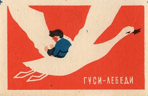
I ffffound these excellent images of vintage mid-century Russian matchbox labels. I love how visual they are - nowadays you only see heavily-branded company matches with text and website addresses, maybe squeezing in a paltry logo. These are actually pretty.
View the full Flickr set of 1950s/1960s artwork from around the world - primarily Eastern Europe - and read about the collector's matchbox design obsession.


View the full Flickr set of 1950s/1960s artwork from around the world - primarily Eastern Europe - and read about the collector's matchbox design obsession.

