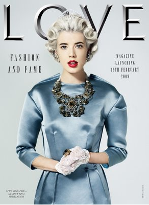
Ignoring all the doom and gloom, Condé Nast stride ahead with launching new titles. High-end, luxury new titles. Here’s a preview of superstylist and POPstar Katie Grand’s new Love magazine.
What are they thinking? I don't like this sterile cover - the faux-regal, austere English pose and typography - especially the bevelled gravestone font. Fashion and fame? Inappropriate and lame! Hmm, let's see how many issues...


